The Proper Art of Writing (1655)
Meditating on the wonders of Creation (a cricket’s stridulations, the waxing moon), the author of Kunstrichtige Schreibart, a seventeenth-century German calligraphy book — whose full title translates to The Proper Art of Writing: A Compilation of All Sorts of Capital or Initial Letters of German, Latin and Italian Fonts from Different Masters of the Noble Art of Writing — compares beautiful writing to tending a farm. The paper is our field; it propagates the crops of teaching, knowledge, and business. But letters are the plow, which create the furrows out of which all matters of the mind can spring. Even memory fits into this analogy: reading “dries up the brain’s moisture”; writing irrigates knowledge for future generations. And to write properly — with calligraphic skill — ensures a bountiful harvest.
Kunstrichtige Schreibart appeared during a watershed moment in the history of typography and calligraphy, when, in the Reformation’s wake, German handwriting educators broke from the traditions of Italianate penmanship and revived the Fraktur script, preferring Gothic pointedness to fanciful whorls and rococo loops. This was also an era when calligraphic writing emerged as an artform in its own right, which was subject to much debate and conjecture. As Hannah Murphy details, complex systems of lettermaking required an expanded theoretical vocabulary, including nutzlich (calligraphic knowledge) and zierlich (stylistic quality). Curiously, “the transformative power inherent in writing” was not limited to the aura of the original calligraphy itself, but was thought to spread losslessly into copies. Hence books like Kunstrichtige Schreibart served both as advertisements of calligraphic skill and copybooks for aspirational scribblers. Unlike his Holy Roman Empire peers, however, Paul Franck, the calligraphy book’s author, did not eschew the baroque style that remained popular outside of the Holy Roman Empire — instead, he intensified it to an almost absurd degree. As James Elkins writes, Franck’s capitals are “so ornate they could scarcely be recognized — or used”, with his “M” looking “more like a monstrous thorn bush than a letter”.
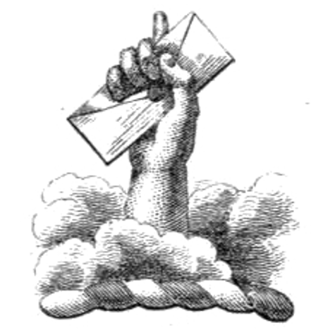
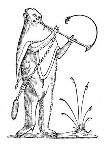
Below you will find a selection of letterforms from Kunstrichtige Schreibart. The letters, almost illegible, seem to dissolve any defensible boundary between penmanship and artistry, proving that writing — even when it is unreadable — can overflow with aesthetic and emotional significance.


 | Underlying Work Rights | PD Worldwide |
| Digital Copy Rights |
| |
 | Download | PDF | Torrent |
 | Found Via |
Oct 18, 2012